Compare Containers
The Compare functionality in EHANDBOOK-NAVIGATOR allows you to compare two EHANDBOOK containers side by side seamlessly. It helps you to identify differences in content, ensure accuracy, and maintain consistency across documents and document versions. With user-friendly navigation and customizable options, it simplifies the review process.
License information
To use the Compare functionality in EHANDBOOK-NAVIGATOR, you need an AddOn license. For further information, see the License Feature Overview
Comparison levels
Tree view comparison
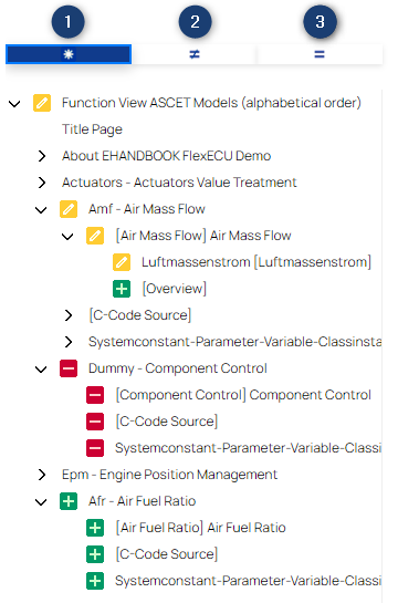
The EHANDBOOK containers are structured using the Table of Contents (TOCs). The Compare functionality identifies differences between the ToCs of the two containers and displays them in a structured tree view. This visual representation helps you grasp the overall organization and navigate easily through topics and subtopics.
The tree view uses icons and arrows to represent changes visually:
Icons Indicating Changes:
-
Unchanged
 : Icon indicates there is no change in the chapter.
 -
Added
 : Icon indicates new topics or sections introduced in the right container.
 -
Removed
 : Icon denotes content present in the left container but has been removed in the right one.
 -
Modified
 : Icon shows entries present in both containers but whose content has been modified.
 -
Error
 : Icon indicates an error occured during the comparison of topics.
Arrows Indicating Changes:
-
Unchanged
 : Arrow indicates there is no change in the chapter.
 -
Added
 : Arrow indicates the chapter or a sub-chapter of it, has been added.
 -
Removed
 : Arrow indicates the chapter or a sub-chapter of it, has been removed..
 -
Modified
 : Arrow indicates the chapter or a sub-chapter of it, has been modified..
 -
Filtering for changes: The tree view can be filtered to focus on specific types of changes.

-
All Content: To display all the content.
-
Modified Content: To display the entries that either
-
have been removed from the left-hand side container
-
have been added to the right-hand-side container
-
or contain modified content.
-
-
Same Content: To only display entries that are identical in the right-left container.
-
Text Filter: Filter the entries by typing the text in the Filter field.
-
Helps to find a certain entry quickly.
-
The wildcard search such as '*' or '?' where the wildcard character(s) is(are) substituted by any of the possible characters is supported as well.
-
For e.g., ct displays all the possible set of entries which contains 'ct' in it.
-
Similarly, '?' is used to replace a character. For e.g., ?ct? displays all the possible set of entries which contains 'ct' by adding any single character before and after 'ct'.
-
Textual comparison
You can open the content of the two compared containers by clicking on any entry in the tree view. The contents will be displayed side-by-side with synchronized scrolling. EHANDBOOK will always display the content as it is in the respective container. If the content is unmodified, both sides will look the same. If the entry has been added in the right container, its content will only be visible on the right side, while the left side remains empty. On the other hand, if the content has been removed, it will only be visible on the left side, while the right side remains empty. If the TOC entry is available on both sides but is not identical, the differences will be marked using a colored highlighting as follows.
-
Red: content has been removed
-
Green: content has been added
-
Yellow: content has been modified
|
If an entry in the treeview is not clickable, the entry does not have a content of it’s own. |
Image Comparison
Within the compared content, images are marked with a colored border if some difference has been detected between left container and right container. As with the other content, the color indicates:
-
Red: image has been removed
-
Green: image has been added
-
Yellow: image has been modified
For images that contain modifications EHANDBOOK-NAVIGATOR offers a functionality to show details on where the differences are located within the images. On right-click, a context menu is available. Select "Show detailed differences" to open a new tab which displays a layover of the two compared images where the differences are highlighted. The color used for this highlighting can be configured in the preferences.
|
Images can contain differences in meta data that are not visible. EHANDBOOK-NAVIGATOR can still categorize these images as modified, even though the detailed image difference will not show any visible differences. |
Limitation
Note that with EHANDBOOK-NAVIGATOR 13.0 the documentation content will be compared based on whole paragraphs. This leads to the whole paragraphs being marked as added or removed in case of differences. With the next versions of EHANDBOOK-NAVIGATOR, a more detailed comparison will be possible.
Navigating through the differences
The split-screen viewer features navigation buttons that allow you to move through differences one at a time. This functionality is particularly useful for detailed reviews, as it ensures you can focus on each change without losing track of their position. The currently reviewed difference will be marked using an additional border around the colored highlighting indicating the type of change.
Customization options
To ensure good usability, you can customize the colors used to highlight the differences in your preferences.
How to Use the Compare Functionality

-
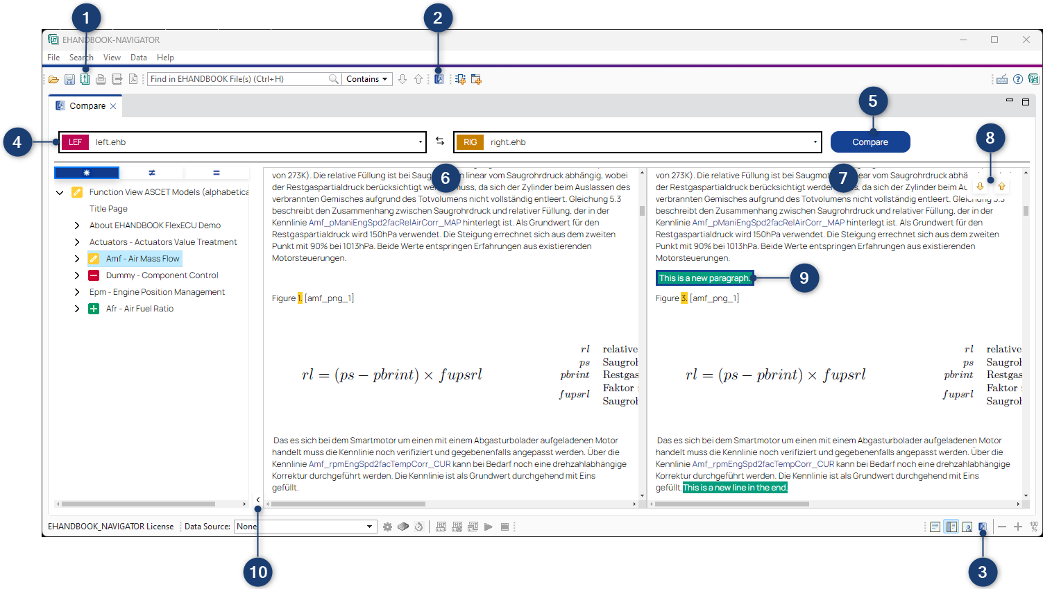
Load or choose EHANDBOOK Containers: First, ensure that both EHANDBOOK containers you wish to compare are already loaded in the ETAS EHANDBOOK-NAVIGATOR by opening the
Manage Project…dialog (1). Alternatively, EHANDBOOK containers can be chosen without being part of an EHANDBOOK project using the optionChoose EHANDBOOK Container…inside the dropdown menus (4). -
Open the "Compare" perspective: It can be opened via the View menu (2) or use the button (3) in the main toolbar.
-
Select Containers: Utilize the dropdown menus (4) at the top of the comparison perspective to select the two EHANDBOOK containers you want to compare. The left container will be treated as a reference, and differences will be marked accordingly.
-
Start the comparison: When you click the Compare button (6), the comparison will start.
-
Swap compared Containers: If you want to swap the currently compared containers (left and right), you can use the Swap button (5). This will exchange the containers and update the comparison.
|
Depending on the size of the containers, this might take some time.A popup dialog will inform you about the progress of the comparison. The comparison can be aborted by clicking on the cancel button, which will stop the comparison at the next possible step. |
-
View the TOC: Once the comparison is done, the Tree View will automatically display the TOC for both containers, showcasing their respective structures. The visual markers and icons will help you quickly recognize which topics or subtopics have been added, removed, or modified.
-
Explore Textual Differences: Click on any entry in the TOC to open the split-screen viewer. The left panel (7) will show the content from the left EHANDBOOK container, while the right panel (8) will display the content from the right container. Review the marked changes in the text to understand the modifications made.
-
Filter Differences: Click on settings button (12) next to navigation buttons to open the settings panel. The following filter options(13) are available:
-
Ignore Whitespace: Hides differences that consist only of whitespace changes.
-
Text changes: Shows or hides text differences.
-
Table changes: Shows or hides table differences.
-
Image changes: Shows or hides image differences.
-
-
Navigate Through Differences: Use the navigation buttons (9) in the split-screen viewer to move through the marked differences in the opened chapter. This feature allows you to review changes one by one, ensuring a thorough examination of the content. The currently examined difference will be highlighted by an added border (10). Right to the navigation buttons you will see the total amount of difference and the index of the marked difference.
-
Collapse the TOC: If you prefer a larger viewing area for the textual comparison, click the collapse button (11) to hide the Tree View. This will give you a more spacious view, allowing you to focus entirely on the content.
Label Popup in Compare
To display the metadata of labels, you can open the Label Popup by clicking the label name highlighted in blue. For details see Label Popup.
|
The information loaded from any additional files (such as A2L, HEX, DCM) will be the same in the Label Popups for corresponding labels in the left and right container. Externally loaded containers in compare do not support the loading of corresponding files. |
Search Compare results
You can search the displayed comparison results using the shortcut Ctrl+F. See Search Views for details.